
S&P 500 (1/3/17 – 1/11/19)
[uberchart id=”382″]
Data provided by DTN IQFeed.
h Trend Following Basics for U.S. Equities
Preface: This information is meant to be for educational commentary only. It is designed to provide statistical information about stock market trends and the stock market. This information is not meant to display backtested market information nor infer past performance of a backtested model.
The question: For investors using quantitative trend-following analysis, the goal is to be invest in securities that are moving higher in price or from a macro-level invest in the market when it is going up. What we, as trend followers, are not trying to do is make market predictions or define where the market should be on a future date. The world is full of fortune tellers, weather forecasters, and talking heads predicting the future, but we are not trying to sell commercials or read palms. Instead, we are just trying to follow the crowd. This begs the question, “How do you define up?”
The answer: There is an old Wall Street saying, “They do not ring a bell at the bottom” (or the top for that matter). If you do not know if you just past the bottom or the top, you cannot say for certain which direction you are headed. However, what you can do is have a set of rules that you follow and maintain a disciplined approach to following the market. We would caution investors that this is not a magically switch you can flip, but instead it takes a great deal of time and patience. Furthermore, it is important for investors (or everyone for that matter) to know what they are looking for.
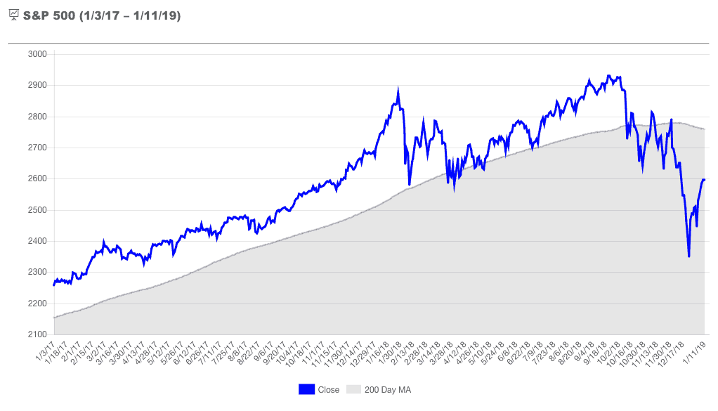
Defining the rules: Since the stated goal of trend following is to follow the crowd or invest in up markets, we need to define the broader market. For that we use the S&P 500. More specifically, we use the S&P 500 and its relationship to its 200 Day Moving Average (pictured above). When the S&P 500 crosses above its 200 Day Moving Average, this is said to be a bullish cross or as some call it “The Golden Cross”. When the index crosses below its Moving Average, this is called a bearish cross. The above chart is a fairy small historical window showing approximately two years of market data, and based upon a quick glimpse of the chart it appears that using the S&P 500 and its 200 Day Moving Average, we can have a pretty good understanding of the current direction of the broader market. That being said, the roughly 500 trading days shown in the chart is a small sample size. In addition, it is very easy to overlook how the index moves back and forth above and below the 200 Day moving average when the price of the index is near its average price. Let’s expand that data, and take a different perspective.
Bullish and Bearish Crosses for the S&P 500 (8/13/1999 – 12/4/2018)
[uberchart id=”481″]
Data provided by DTN IQFeed.
h Connecting the Dots
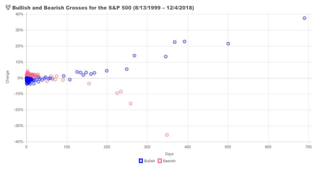
A Closer Look: The above chart is a scatter plot of the change (vertical axis) and calendar days (horizontal axis) of bullish (blue) and bearish (red) crosses for the S&P 500 since August 13, 1999. There are two important things to consider about this chart. First of the 196 times the S&P 500 has crossed above or below its 200 Day Moving Average during this period, there are 167 instances, or roughly 84% of the occurrences, when the “bullish” or “bearish” trend lasted less than 50 calendar days. If you are a long-term investor in the stock market you might be turned off at the thought of using this indicator as a metric for investing. What is worse of the 99 bearish crosses, 88 times the index closed higher when the it crossed back over, and of the 98 bullish crosses during this time period, the index only closed higher 18 times when it crossed back below its moving average. These basic statistics should give any rational investor pause about the merits of using trend following with S&P 500 and its 200 Day Moving Average.
Patience and Discipline: If you are still reading this, you are probably wondering why this is worth writing about much less taking the time to put together interactive charts breaking down past outcomes. There are important concepts to understand about market trends. First, the market whipsaws around its Moving Average making it an unreliable indicator for short-term trading or for investors who lack discipline. Second, the market goes down quickly and goes up slowly. There is another Wall Street adage that investors should be concerned with. “The market takes the stairs up and the elevator down.”
Finally good news: Let us look at the data for the periods where the S&P 500 stayed above or below its 200 Day Moving average for more than 100 days. (Take your left hand and place it in front of the 100 on the horizontal axis of the above chart.) Of the 15 instances where the S&P 500 had bullish crosses that lasted more than 100 calendar days, only 1 time did it produce a negative return. Conversely, of the five instances the S&P 500 stayed below its 500 Day Moving Average during this time period all five times index produced negative returns. This is the bread and butter of trend following. This is where portfolio managers who use trend following analysis are able to grow the wealth of their clients or avoid a sizable chunk of the downside risk that is inherit in investing in stocks. As we stated previously, trend following takes patience and discipline. Investors cannot expect to have one side of the 100 Days without the other.
It should also be noted, that the data on this scatter plot is from one point to the next. In other words, it is measured from one bullish cross to the next bearish cross and vise-versa. Not from market tops to market bottoms, and it does not include the current bearish cross as it has no proceeding bullish cross to match it against. So this leaves the question, “Where are we now?”
Bearish Crosses for the S&P 500 (8/13/1999 – 1/11/2019)
[uberchart id=”504″]
Data provided by DTN IQFeed.
h Here and Now
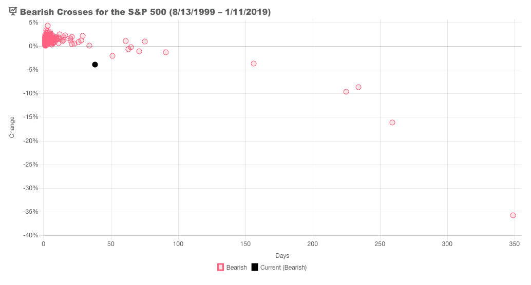
“Where are we now?”: Precisely 38 days removed from a bearish cross as of 1/11/2019. We have excluded the bullish market crosses and added the current market trend in black in the scatter plot above. And while -3.84% sounds tame, keep in mind that is just a measure from the cross of close and the Moving Average, and does not measure the percent change from the highest closing price of the index above the moving average. As of January 11, 2019, the index is down -11.41% from its highest close price in 2018 (September 20, 2018).
Not out of The Woods Yet: We will leave you with one final Wall Street adage. “History doesn’t repeat itself, but it often rhymes.” While the market has recently rebounded off of its Christmas Eve low of 2351.10 on the S&P 500 by over 10% as of the close on January 11, 2019, investors should remain cautious. Investors shrug off bad news in bull markets, and bad news piles up in bear markets. With the current government shut down in Washington, investors are wondering how much it will impact the economy as we head in to earning season. It is a fool’s errand to try to predict what will happen in Washington D.C. or on Wall Street, but it is important to take note of where we are now and where we have been.
Disclosures
The S&P 500 is an unmanaged, market capitalization weighted index of 500 widely held stocks. The index is composed of 500 constituent companies and is often used as a benchmark for the U.S. stock market. Please note that investors cannot directly invest in an index.
This report is for educational information only, and does not imply past performance or backtested results. All investing involves risk, including the potential for loss of principal.
S&P 500 (1/3/17 – 1/11/19)
Data provided by DTN IQFeed.
h Trend Following Basics for U.S. Equities
Preface: This information is meant to be for educational commentary only. It is designed to provide statistical information about stock market trends and the stock market. This information is not meant to display backtested market information nor infer past performance of a backtested model.
The question: For investors using quantitative trend-following analysis, the goal is to be invest in securities that are moving higher in price or from a macro-level invest in the market when it is going up. What we, as trend followers, are not trying to do is make market predictions or define where the market should be on a future date. The world is full of fortune tellers, weather forecasters, and talking heads predicting the future, but we are not trying to sell commercials or read palms. Instead, we are just trying to follow the crowd. This begs the question, “How do you define up?”
The answer: There is an old Wall Street saying, “They do not ring a bell at the bottom” (or the top for that matter). If you do not know if you just past the bottom or the top, you cannot say for certain which direction you are headed. However, what you can do is have a set of rules that you follow and maintain a disciplined approach to following the market. We would caution investors that this is not a magically switch you can flip, but instead it takes a great deal of time and patience. Furthermore, it is important for investors (or everyone for that matter) to know what they are looking for.
Defining the rules: Since the stated goal of trend following is to follow the crowd or invest in up markets, we need to define the broader market. For that we use the S&P 500. More specifically, we use the S&P 500 and its relationship to its 200 Day Moving Average (pictured above). When the S&P 500 crosses above its 200 Day Moving Average, this is said to be a bullish cross or as some call it “The Golden Cross”. When the index crosses below its Moving Average, this is called a bearish cross. The above chart is a fairy small historical window showing approximately two years of market data, and based upon a quick glimpse of the chart it appears that using the S&P 500 and its 200 Day Moving Average, we can have a pretty good understanding of the current direction of the broader market. That being said, the roughly 500 trading days shown in the chart is a small sample size. In addition, it is very easy to overlook how the index moves back and forth above and below the 200 Day moving average when the price of the index is near its average price. Let’s expand that data, and take a different perspective.
Bullish and Bearish Crosses for the S&P 500 (8/13/1999 – 12/4/2018)
Data provided by DTN IQFeed.
h Connecting the Dots
A Closer Look: The above chart is a scatter plot of the change (vertical axis) and calendar days (horizontal axis) of bullish (blue) and bearish (red) crosses for the S&P 500 since August 13, 1999. There are two important things to consider about this chart. First of the 196 times the S&P 500 has crossed above or below its 200 Day Moving Average during this period, there are 167 instances, or roughly 84% of the occurrences, when the “bullish” or “bearish” trend lasted less than 50 calendar days. If you are a long-term investor in the stock market you might be turned off at the thought of using this indicator as a metric for investing. What is worse of the 99 bearish crosses, 88 times the index closed higher when the it crossed back over, and of the 98 bullish crosses during this time period, the index only closed higher 18 times when it crossed back below its moving average. These basic statistics should give any rational investor pause about the merits of using trend following with S&P 500 and its 200 Day Moving Average.
Patience and Discipline: If you are still reading this, you are probably wondering why this is worth writing about much less taking the time to put together interactive charts breaking down past outcomes. There are important concepts to understand about market trends. First, the market whipsaws around its Moving Average making it an unreliable indicator for short-term trading or for investors who lack discipline. Second, the market goes down quickly and goes up slowly. There is another Wall Street adage that investors should be concerned with. “The market takes the stairs up and the elevator down.”
Finally good news: Let us look at the data for the periods where the S&P 500 stayed above or below its 200 Day Moving average for more than 100 days. (Take your left hand and place it in front of the 100 on the horizontal axis of the above chart.) Of the 15 instances where the S&P 500 had bullish crosses that lasted more than 100 calendar days, only 1 time did it produce a negative return. Conversely, of the five instances the S&P 500 stayed below its 500 Day Moving Average during this time period all five times index produced negative returns. This is the bread and butter of trend following. This is where portfolio managers who use trend following analysis are able to grow the wealth of their clients or avoid a sizable chunk of the downside risk that is inherit in investing in stocks. As we stated previously, trend following takes patience and discipline. Investors cannot expect to have one side of the 100 Days without the other.
It should also be noted, that the data on this scatter plot is from one point to the next. In other words, it is measured from one bullish cross to the next bearish cross and vise-versa. Not from market tops to market bottoms, and it does not include the current bearish cross as it has no proceeding bullish cross to match it against. So this leaves the question, “Where are we now?”
Bearish Crosses for the S&P 500 (8/13/1999 – 1/11/2019)
Data provided by DTN IQFeed.
h Here and Now
“Where are we now?”: Precisely 38 days removed from a bearish cross as of 1/11/2019. We have excluded the bullish market crosses and added the current market trend in black in the scatter plot above. And while -3.84% sounds tame, keep in mind that is just a measure from the cross of close and the Moving Average, and does not measure the percent change from the highest closing price of the index above the moving average. As of January 11, 2019, the index is down -11.41% from its highest close price in 2018 (September 20, 2018).
Not out of The Woods Yet: We will leave you with one final Wall Street adage. “History doesn’t repeat itself, but it often rhymes.” While the market has recently rebounded off of its Christmas Eve low of 2351.10 on the S&P 500 by over 10% as of the close on January 11, 2019, investors should remain cautious. Investors shrug off bad news in bull markets, and bad news piles up in bear markets. With the current government shut down in Washington, investors are wondering how much it will impact the economy as we head in to earning season. It is a fool’s errand to try to predict what will happen in Washington D.C. or on Wall Street, but it is important to take note of where we are now and where we have been.
Disclosures
The S&P 500 is an unmanaged, market capitalization weighted index of 500 widely held stocks. The index is composed of 500 constituent companies and is often used as a benchmark for the U.S. stock market. Please note that investors cannot directly invest in an index.
This report is for educational information only, and does not imply past performance or backtested results. All investing involves risk, including the potential for loss of principal.
