
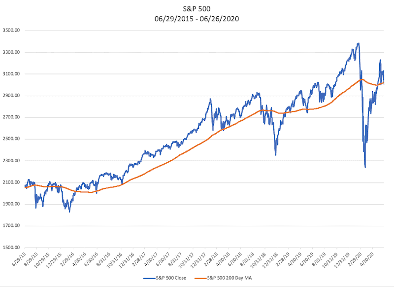
By the Numbers
On February 19, 2020, the S&P 500 closed at an all-time high at 3,386.15. Just 33 days later, investors had witnessed a -33.92% correction when the S&P 500 closed at 2,237.40. On June 26, 2020, the S&P 500 closed at 3009.05, marking a 34.48% rebound from the low on March 23, 2020. As we look back on the first half of the year, I think it is essential to put these market fluctuations into historical context so that we can outline potential near-term market risks.
The Trend is Your Friend
Typically during long-term market uptrends, more than half of stocks are increasing in value. More precisely, if a particular index is going up, this generally means that at least half of the stocks that make up the index are also going higher. There are some exceptions to this, of course. Because some index calculations are weighted, there are instances when the stocks with the most significant weights in a particular index are moving the index higher. I think this is important to understand, but it is generally the exception to the rule. All of this being said, when a majority of stocks are moving higher in price, it is much easier for investors to make money by owning stocks. Of course the more complicated part of the equation is how do investors understand when the market is going up over the long-term?
For a macro overview of the “market,” I like to use the 200 Day Moving Average of the S&P 500. This indicator is quite simple; each point on the line represents the previous 200 trading days averaged together. The visual representation of the market trend here can be quite stunning. Moving Averages are probably the most common form of technical analysis. And now, all kinds of moving averages exist with different periods and different weights. Some investors and technical analysts use two Moving Averages with different periods instead of using the actual price and the 200 Day Moving Average that I use in this piece. Investors have even given names to the point at which the price crosses the Moving Average. The Golden Cross or Bullish Cross occurs when the price crosses above the Moving Average. The Death Cross or Bearish Cross occurs when the price crosses beneath the Moving Average. However, I would like to caution investors of one of the significant drawbacks of using moving averages in general.
Head Fakes
In 1977, the late-great Muhammad Ali fought Michael Dokes in an exhibition match. Of course, Ali was much closer to the end of his career than he was the beginning at this point. Ali never knocked another boxer down after 1976. But the Ali-Dokes fight gave us one of Ali’s most memorable moments. Dokes was a young up and coming boxer trying to make a name for himself. Ali was as great a performer as he was a boxer, and he was one of the best boxers ever to live. If you go back and watch the fight, Ali backs himself into a corner and then proceeds to dodge 21 punches in 10 seconds. Ali never moved his feet during this barrage of punches, and he dodged all of the punches with head fakes. Investors relying on the 200 Day Moving Average face the same problem Michael Dokes did: head fakes.
Because we are using a simple mathematical averaging of prices, there many instances where the prices move above or below the moving average only to reverse course a few days later. In fact, for very short-term time horizons, I would even argue that the 200 Day Moving Average is not a useful metric.
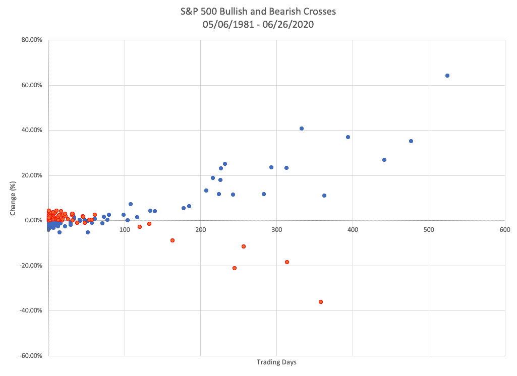
Here is a scatter plot of the S&P 500 and its 200 Day Moving Average. The blue dots represent “Bullish Crosses,” and the red dots represent “Bearish Crosses.” The horizontal axis represents the number of trading days since the S&P 500 closed above the 200 Day Moving Average (blue dots) or the number of days since the S&P 500 traded below its 200 Day Moving Average (red dots). (Note a year is roughly 252 trading days and a month is approximately 22 trading days.). The vertical axis represents the percent change since the values crossed.
This chart could be titled the Tale of Two Parts. If you look at the horizontal axis below the 50-day mark, you would think that the 200 Day Moving Average is a horrible indicator of a market trend. In fact, by looking at only this data, you would be led to believe that investors should trade in the opposite direction of the “Bullish and Bearish Crosses.” But when we reveal the data beyond 50-days, we can see how well the 200 Day Moving average defines long-term trends in the stock market. The 200 Day time period is not unique in the degree of what I would call head fakes. Instead, this is just a function of averaging daily prices. In other words, changing the period from 200 Days to any other period results in the same moving above and below the moving average.
If you look closely, the chart tells another story about how markets move. Although moving averages don’t measure the price from trough to peak and vice-versa, we can see in this chart that markets tend to move upward slowly while moving downward quickly.
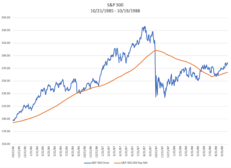
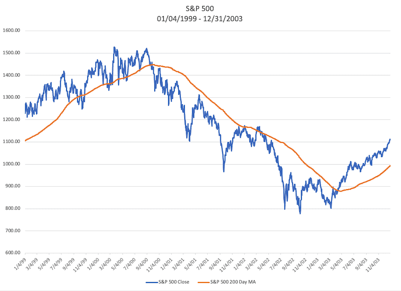
All of these charts paint a pretty good picture of long-term market trends, and they can be a decent macro overview of what is happening with long-term market moves. There are a few outlying risks that aren’t clearly illustrated in these charts. These are risks that I try to be mindful of as a portfolio manager and investor. These market risks are represented in the charts (intentionally) but can be hidden in the noise. So if we use this past data as possible future outcomes, the two time periods that always give me pause are 1987 and 2000. Many investors fear a repeat of the 2008 housing crisis, probably as a result of recency bias. However, I would argue 2008 was an example of a trend reversal where investors could have avoided some part of the downside by using Moving Average. 1987 and 2000 were much different.
Up, Down or Sideways
Sometimes we do not know what is right around the corner, and I think that is the case we have witnessed in the first half of this year. Sometimes, however, history doesn’t repeat itself, but it often rhymes. Nonetheless, I think it is important to attempt to quantify potential market outcomes. I think the most probable outcome we face is an extended period of market fluctuations choppy moves up and down moving, sideways with no clear trend. Perhaps this is the most straightforward forecast because it happens so frequently when market trends change direction. (See the scatter plot above.)
The most significant risk we face today is a repeat of the tech crash of 2000 where the market slipped without gaining any traction over several years. The world is much different today than it was in the late 90s and early 2000s, but the headwinds are still extreme. We are trying to live amid a pandemic and, we are coming up on a mid-term election cycle. From a technical market standpoint, the S&P 500 Index, which most people use as a bell-weather for the stock market, has not closed higher than its previous closing high before the market turmoil in March. The S&P 500 may very well be above its 200 Day Moving Average at any point in the remainder of 2020, but it will be tough to argue that the market is moving higher until the S&P 500 closes above its previous high. Think about it this way, assuming the S&P 500 moves higher from the time you read this until some point in the future but remains below that previous high, the market has still just moved sideways.
With all of this doom and gloom laid out, a potential outcome is that the S&P 500 does continue higher. The previous high before the recent market downturn is undoubtedly within reach at this point. And when markets do trend higher, they often ignore bad news and just drift higher. We may be in a market cycle where this happens.
The goal of Technically Speaking is to give investors a visual representation of where we are now how we may move forward. If you have any thoughts or questions, feel free to reach out to me at jwa@adamswm.com. If you enjoyed reading this, feel free to forward it to a friend.
